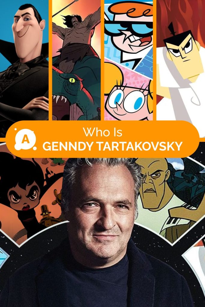
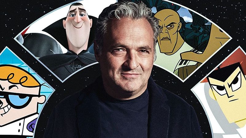
Who is Genndy Tartakovsky?
Genndy Tartakovsky‘s animated films—Hotel Transylvania, Samurai Jack, and Primal—have become iconic thanks to their unique visual style and memorable characters. In this article, we explore how the director’s creative vision shaped the distinct style of these animations.
Where Genndy Tartakovsky Started
The first step in his animation education was at Columbia College in Chicago. There, Genndy developed a passion for animation thanks to his instructor, Stan Hughes, and his collection of classic animation films. Genndy Tartakovsky meticulously studied and traced every frame, honing his drawing skills and learning how to bring drawn characters to life.
Later, Tartakovsky enrolled in the California Institute of the Arts in Los Angeles, where he studied for two years.

After completing his education, Genndy Tartakovsky landed his first industry job thanks to Craig McCracken, an American writer, director, and producer. McCracken, who had just been appointed as the art director for 2 Stupid Dogs at Hanna-Barbera, recommended that Rob Renzetti and Tartakovsky be hired. This marked a significant turning point in Genndy’s career.
Hanna-Barbera gave Tartakovsky, McCracken, and Renzetti the opportunity to work in a trailer on the studio lot, where Tartakovsky developed some of his most famous projects.
Dexter’s Laboratory evolved from a student film of the same name that he created while studying at the California Institute of the Arts. Tartakovsky also co-wrote and illustrated issue 25 of the Dexter’s Laboratory comic series, titled “Beard to Be Feared,” and contributed to several stories compiled in Dexter’s Laboratory Classics.
In addition, he was involved in producing The Powerpuff Girls, co-directing several episodes, and served as the animation director and cinematographer for the feature film.
“My career has always been unpredictable, and I don’t know where it will go next. But ultimately, it’s my relationships with the people around me and the balance between what I want and what’s required of me that have brought me to where I am today.”
Genndy Tartakovsky has received numerous awards for his work in animation, including four Emmy Awards for Samurai Jack.
How the Idea for Samurai Jack Was Born
According to Tartakovsky, the idea for Samurai Jack came during a conversation with a Cartoon Network executive who suggested that he create a show about a samurai. Initially, Tartakovsky was skeptical, thinking that “samurai stories” had already been done many times before. However, as he continued to develop the concept, he came up with the idea of a samurai who is flung into the future and must fight to find his way back to his own time.
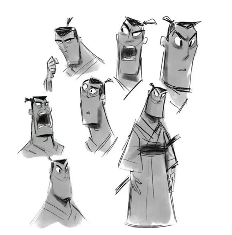
The character of Samurai Jack was conceived as a silent and strong hero, with his minimalist design emphasizing his disciplined and resilient nature.
“Most animated TV shows are filled with constant talking. But I wanted something more. I wanted it to feel like a 70s movie, like The French Connection or something like that.”
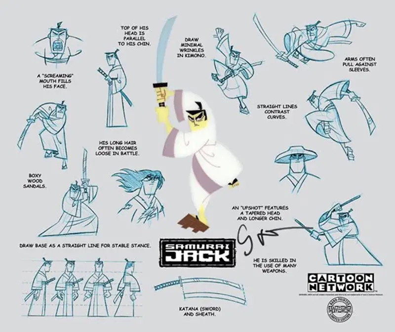
The show premiered on August 10, 2001, and was an immediate success. The series ran for four seasons, comprising 62 episodes, with the final episode airing on September 25, 2004. Samurai Jack quickly became a cult classic and is rightfully considered one of the greatest animated shows of all time. In 2017, the show was revived for a fifth season, which concluded Samurai Jack’s storyline and received critical acclaim.
Shaping the Style of Samurai Jack
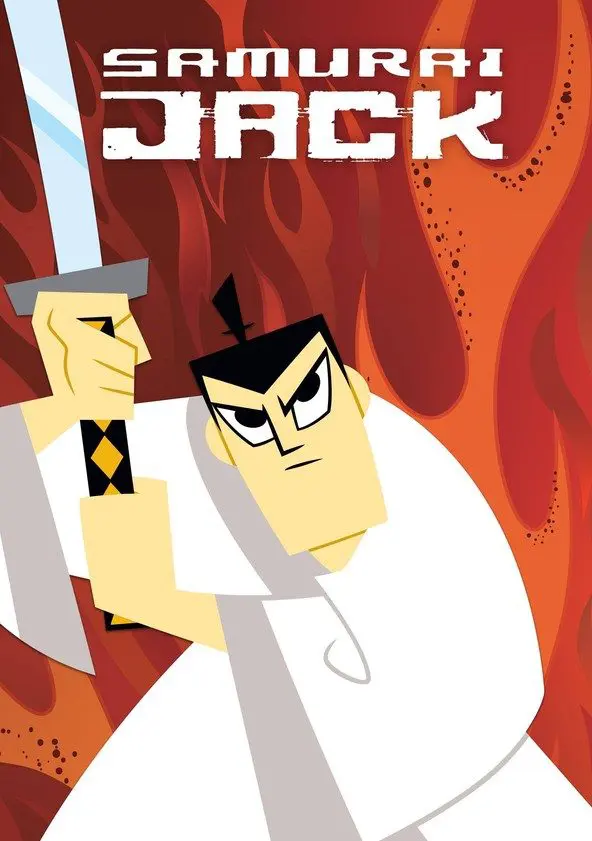
Genndy Tartakovsky developed a unique visual style for the series, drawing inspiration from traditional Japanese art, anime, and the works of American comic book artists.
“I was inspired by the visual culture and design of the U.S. in the 1950s-60s. The design back then was characterized by minimalism combined with strong expressiveness. Every object—whether it was a lamp or a vacuum cleaner—was perceived as an iconic piece.”
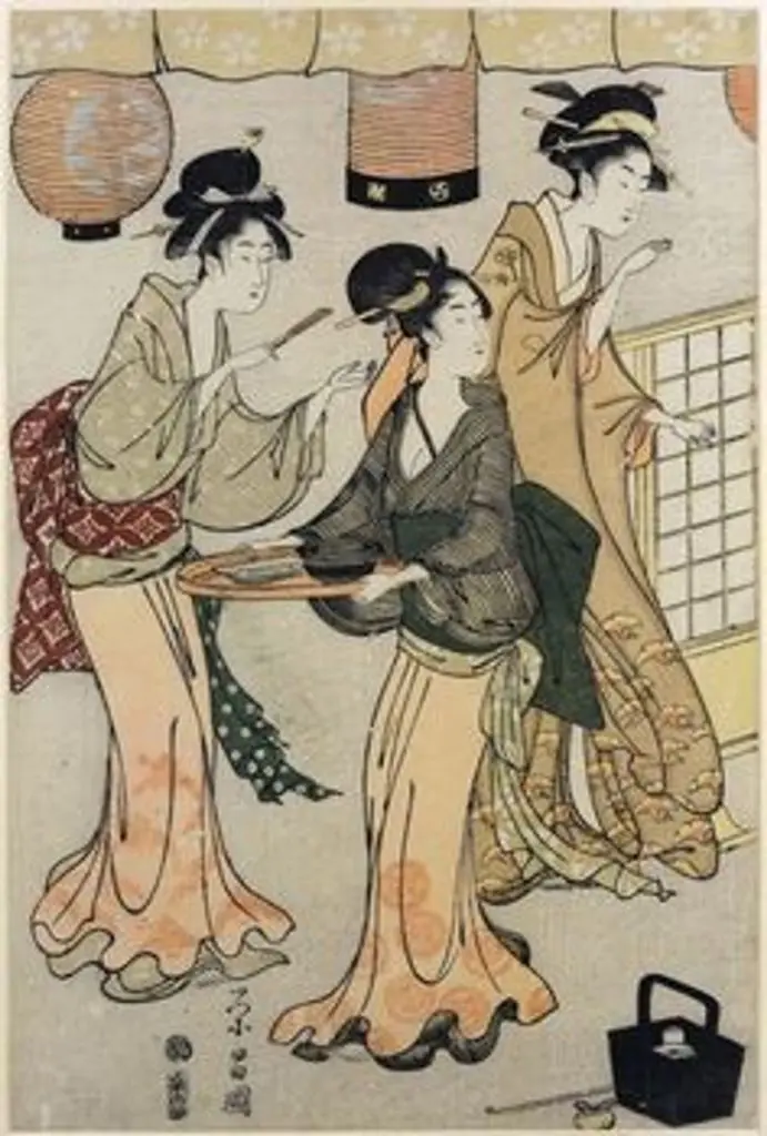
A key influence on Tartakovsky’s style was the Japanese woodblock print art of Ukiyo-e, which had long fascinated him. Ukiyo-e prints often featured bold, stylized figures and dynamic compositions, and Tartakovsky aimed to capture that energy in Samurai Jack.
Tartakovsky’s love for the anime of Hayao Miyazaki and Mamoru Oshii also influenced the series’ style.
Genndy was drawn to the fluidity and expressiveness of Japanese animation, as well as the use of color and light.
Additionally, Tartakovsky was inspired by American comic book artists, particularly Jack Kirby and Frank Miller, who were known for their distinctive styles that transcended realism. Tartakovsky aimed to blend elements from these various influences into a cohesive visual language that would be uniquely his own.
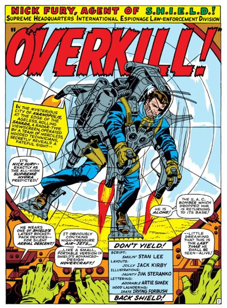
As a result, traditional Japanese art, anime, and American comics blended into one unique style by Genndy Tartakovsky. The use of solid colors, bold silhouettes, and dynamic compositions helped give “Samurai Jack” its distinctive look.
For Tartakovsky, less is more. Black, white, green, and red—these are the only colors used. He frames action like an artist, drawing only the moments essential to convey the essence of the scene and the movement.
What Makes “Samurai Jack” Unique
The style of the “Samurai Jack” animated series has several unique aspects that set it apart from other animated shows:
Concept: “I got the idea for my show from a dream I had when I was about 10 years old. In it, I and a girl I was in love with traveled across a world overrun by mutants, and I found a samurai sword. I don’t think of myself as a 47-year-old family man, but rather as just as young and bold as I was at the start of my career. It’s very easy for me to slip back into that psychological state.” – Genndy Tartakovsky.
Design: The characters and environments in the series are characterized by angular outlines and vibrant colors.
Artistic Style: “Samurai Jack” embodies the principles of minimalism. Despite its deceptive simplicity, the series skillfully uses clear and simple symbols to convey information to the audience. All these elements work together to communicate the essence of actions and the emotions of the hero.
Sound Design: One of the hallmarks of the series is the unusual sparseness of dialogue and music. This makes the moments when music and sound do appear even more impactful. In this respect, some episodes are more “talkative” than others. Jack is generally reserved, speaking only as much as is necessary for the circumstances. However, there are also episodes where nearly ten minutes might pass with almost no words at all.
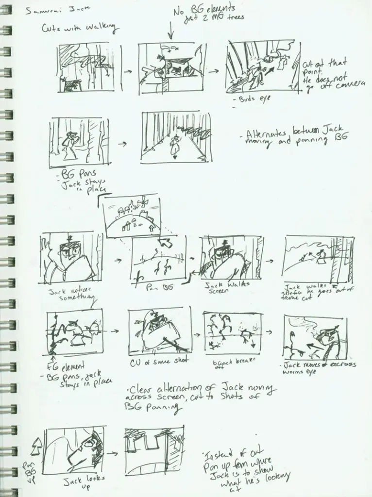
Animation Technique
“Samurai Jack” was animated using Flash, a popular format for animated videos in the early 2000s, created with the Flash software. This technique contributed to the show’s distinct visual style, combining smooth movements with a minimalist aesthetic.
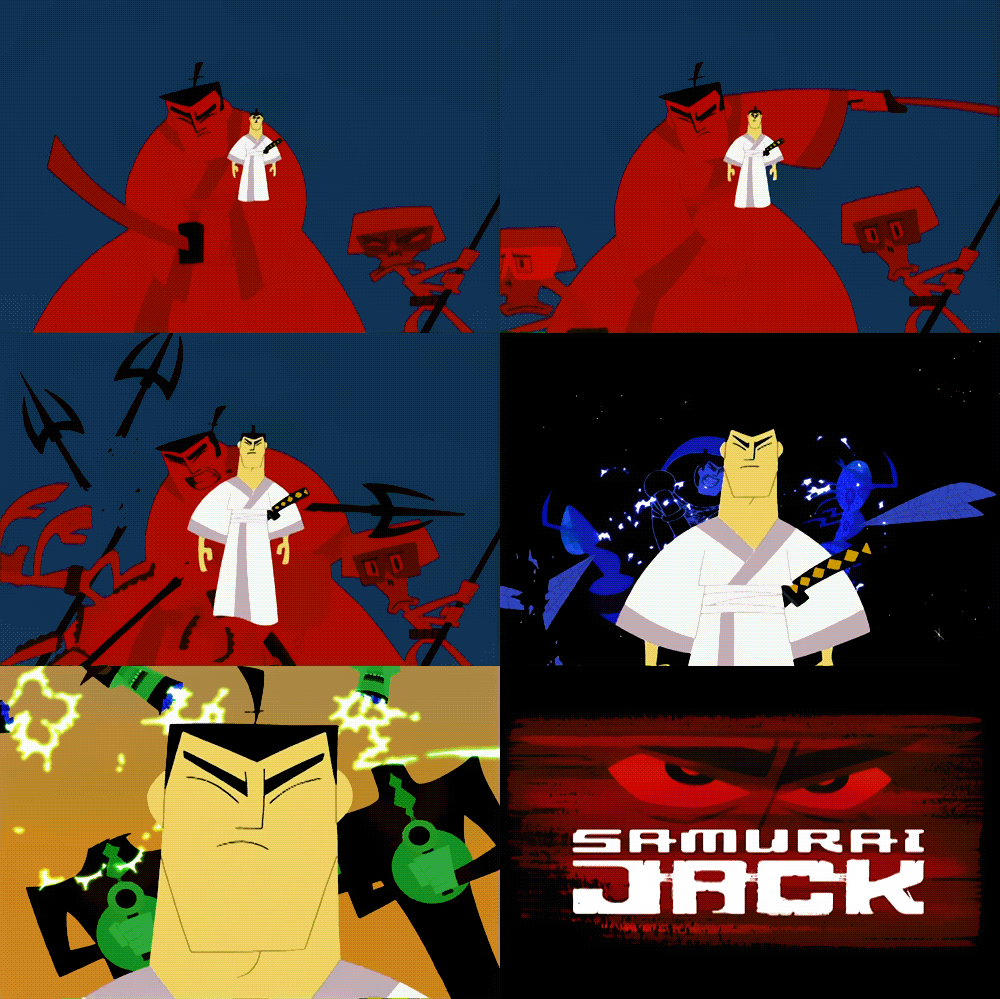
“Samurai Jack” is a unique blend of Genndy Tartakovsky’s artistic style, unconventional concept, animation, and minimalism. The animated series stands out visually and has captivated both audiences and critics alike.
It consistently ranks among the best animated series of all time and has become a signature work for Tartakovsky.
What Makes “Hotel Transylvania” Remarkable
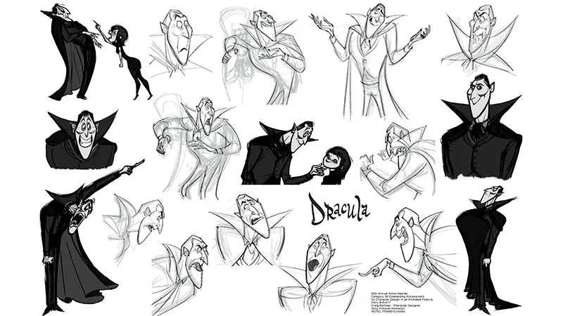
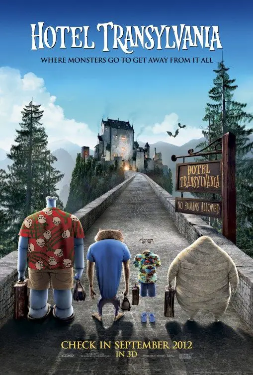
“Dracula is probably the world’s most famous vampire, but not many know that he’s also a great family man,” says Genndy Tartakovsky.
Tartakovsky was involved in every aspect of the film’s production, including character design, animation, and voice direction. He infused the film with his signature comedic touch, adding slapstick humor and witty lines that appeal to both kids and adults.
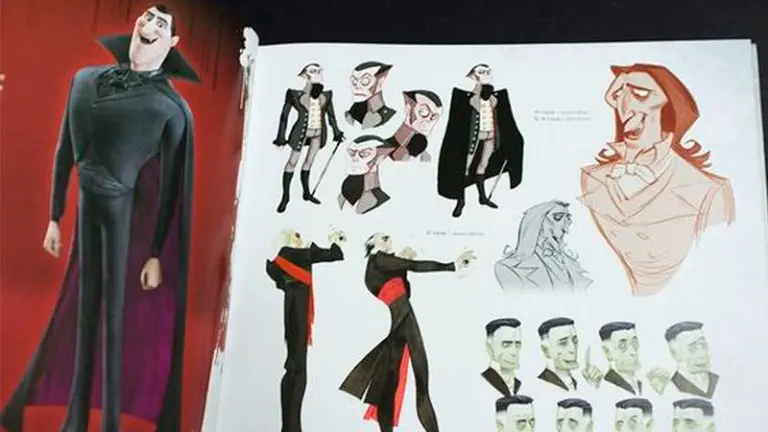
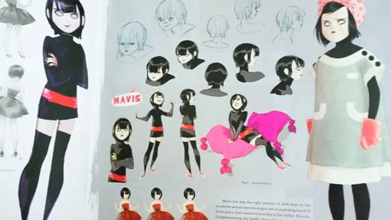
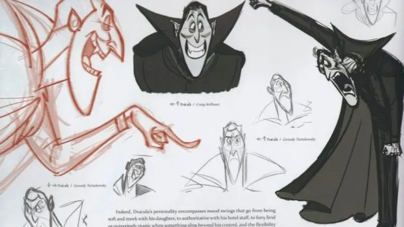
“Hotel Transylvania” was created using a “pushed” animation technique. During the storyboard phase, Genndy personally sketched out designs and key frames for the animation. He aimed to convey his vision as precisely as possible and to guide the large team of artists and animators in staying true to a unified concept.
“I’ve worked with many directors, but Genndy Tartakovsky’s approach is unique,” admits the film’s lead artist, Scott Wills. “He has a clear vision of the film and how he’s going to shoot it. We look at the storyboard in motion and immediately understand what we need to do. This is possible because of Genndy’s extensive experience working on TV series.”
From 2D images to 3D Animation
“Genndy thinks of 3D animation as a series of 2D images that combine to create a full 3D experience,” says Michelle Murdocca, the film’s producer. “For example, when we were reviewing an animation set, he’d sit down with us, notebook in hand, and after observing our work, he’d make a few sketches. These sketches would later become key points for the animators, guiding where the audience’s attention should be focused.”
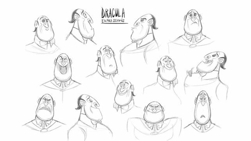
To create the animated film, the animators had to break away from the usual rules, abandon realism, and remove all boundaries and restrictions. The film needed to be as exaggerated and cartoonish as possible.
Typically, animators can work with a basic character model throughout the entire project. However, “Hotel Transylvania” was shaped by Tartakovsky’s unique vision, which called for a variety of character models. While working on the film, the team quickly realized they would need to continuously push their own limits, constantly inventing new ways to animate the characters.
“When we were working on the film, we were literally stepping into the fantastic world that Genndy’s imagination was creating. We tried to understand how he envisioned this world. This was probably the most challenging part of our work—getting on the same wavelength as the director. But even when we were ‘in sync,’ there was no time to relax because Genndy would surprise us every day with new ideas. We learned a lot from him; working with him was like attending animation school.”
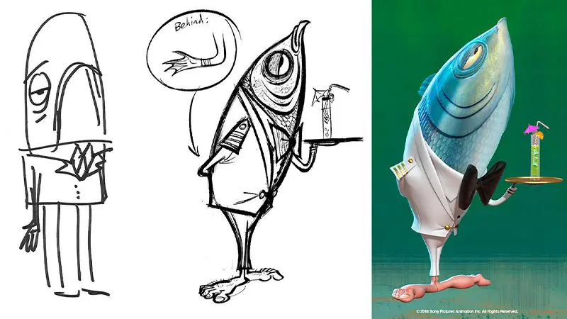
Before starting work on a scene, Tartakovsky would show the animators exactly what he wanted to achieve. He would sketch his ideas on a storyboard and record them on camera.
Filling the Camera
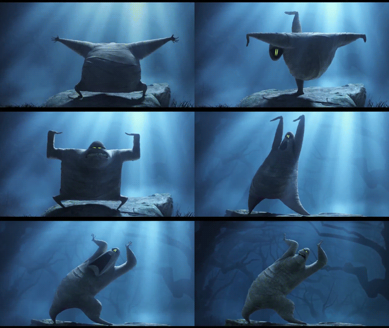
In “Hotel Transylvania,” characters would fill the camera frame, perform incredible acrobatics, and completely defy the laws of gravity. The animation team found it more engaging to focus on the design and energy of the characters rather than their realism.
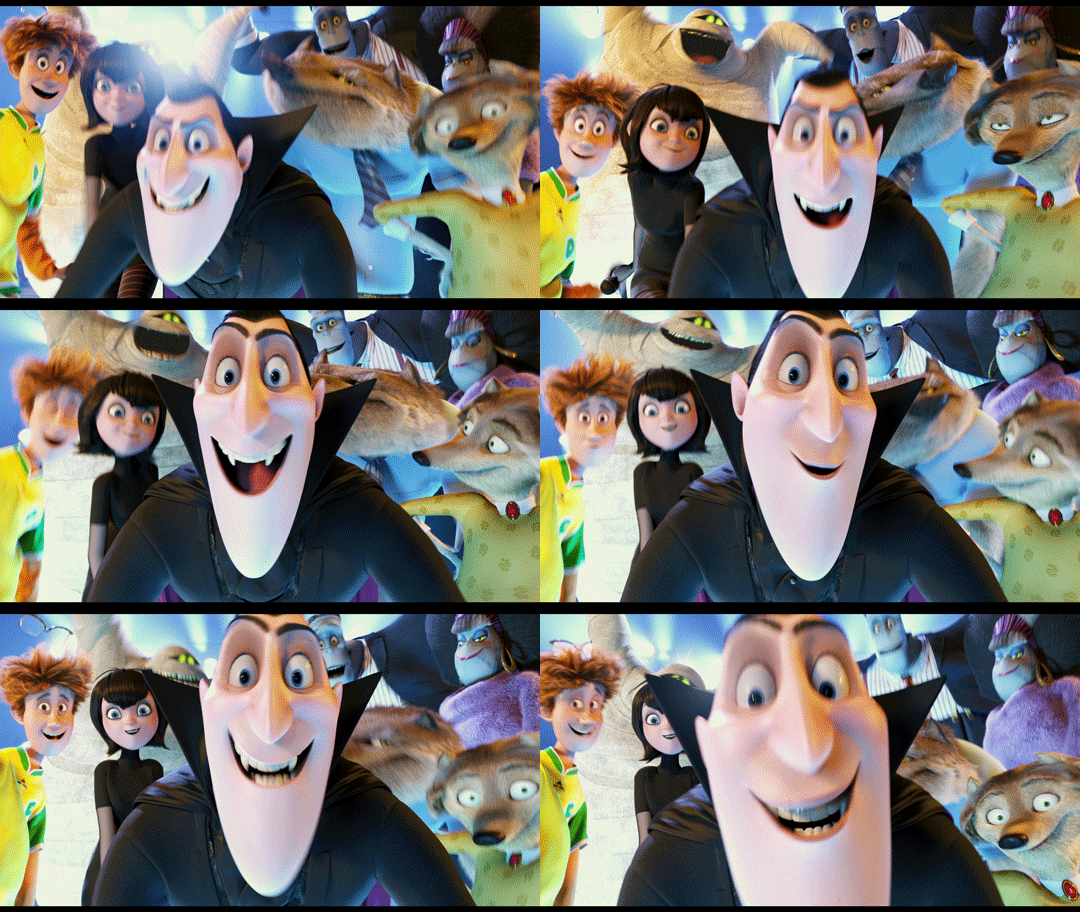
“Genndy’s animation technique breaks established norms,” says special effects specialist Michael Ford. “Our job is to figure out how to bring all his ideas to life.”
Tartakovsky’s animation style was influenced by classic Warner Bros. cartoons, from which he adapted the technique of smear frames (blurry movements) into his projects. When transitioning between poses, characters are deformed and stretched, but this technique only works effectively when strong key poses are established. In “Hotel Transylvania,” expressive poses and fast “blurry” transitions between them are used seamlessly.
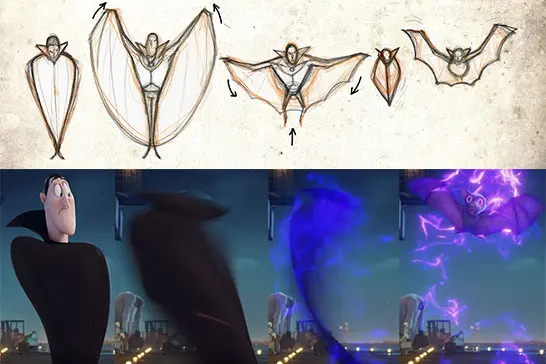
To create a comedic atmosphere, any means were employed. “In many monster movies, dramatic lighting plays a significant role. We used this technique as well, but only to highlight the humor, not the tragedy of the situation.”
A clear example is Dracula’s transformation into a bat. The animators didn’t have intermediate forms where Dracula is half-human, half-bat, so they had to improvise and find unconventional solutions. In the end, Dracula’s silhouette was simplified to a vertical line with a bat layered on top. The transition appeared smoother due to the overlapping silhouettes, and the less successful parts were hidden by special effects.
What’s in Common Between “Samurai Jack” and “Hotel Transylvania”
First, both “Hotel Transylvania” and “Samurai Jack” share Tartakovsky’s signature animation style, which emphasizes fast-paced action, exaggerated movements, and dynamic camera angles. This creates a sense of energy and excitement that is evident in both projects.
Second, there is a strong focus on visual storytelling. In “Samurai Jack,” the show often relies on visual cues and minimal dialogue to convey the story, while in “Hotel Transylvania,” animation and character design are used to communicate humor and emotions.
Another similarity is the use of humor. Both “Hotel Transylvania” and “Samurai Jack” incorporate comedic elements, with “Hotel Transylvania” leaning more towards farce, whereas “Samurai Jack” uses humor to balance its darker themes.
Both shows utilize dynamic camera angles and movements to create a sense of motion and action.
Tartakovsky’s animation style features a limited color palette, with an emphasis on contrasting colors.
The main characters in both shows have strong, distinctive silhouettes that help them stand out against other characters.
Finally, both “Hotel Transylvania” and “Samurai Jack” are known for their unique and creative character designs. In “Samurai Jack,” characters are stylized and cartoonish, while “Hotel Transylvania” characters are endowed with unique personalities and traits that make them both funny and endearing.
Overall, despite the significant differences in setting and plot, these projects share many commonalities in animation style, storytelling, humor, and character design, which are hallmarks of Genndy Tartakovsky’s creative work.
“Primal”

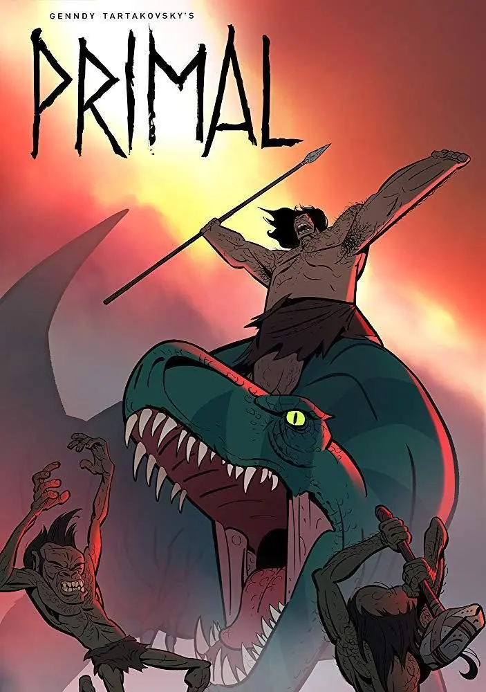
The series premiered on Adult Swim in October 2019. Set in a prehistoric world, it follows the story of a caveman named Spear and a tyrannosaurus named Fang, who form an extraordinary bond after both their families are killed.
The series heavily relies on visual effects and primal sounds to convey the emotions and experiences of its characters. It explores mature themes, including death and grief, marking a departure from Tartakovsky’s previous works, which were more geared towards children.
“Primal” has received critical acclaim for its animation, emotional storytelling, and unique take on the prehistoric world. Tartakovsky recently announced that production has begun on the third season of the show.
A Story Without Dialogue
According to Genndy, the idea for the animated series “Primal” came to him during a conversation with a friend about the nature of violence. Tartakovsky wanted to explore the primal nature of violence and survival in a story without dialogue.
“I actually don’t like blood, violence, and all that stuff. But I needed it to create an emotional connection with the characters. If violence raises the stakes in their relationships and makes them more intense, then we’ll include it.”
Tartakovsky aimed to depict a time before civilization and technology, when life was simple and brutal.
To further develop the concept, the director and his team created a short pilot episode that showcased the unique visual style and tone of the series. The pilot was well received, and Adult Swim greenlit the series.
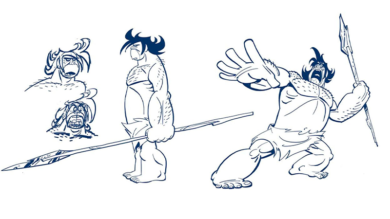
Tartakovsky approached the creation of “Primal” with a different mindset compared to his previous work, focusing on visual effects and storytelling rather than dialogue and humor. He also worked closely with the show’s art director, Scott Wills, to develop the series’ distinctive artistic style.
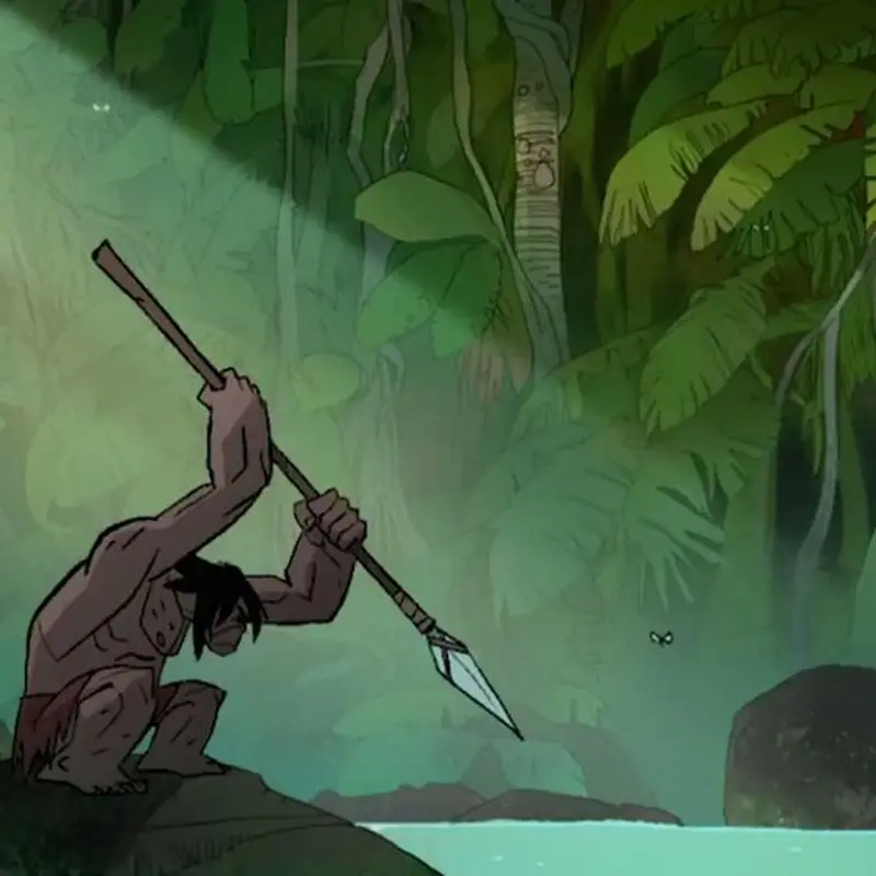
By the way, Primal is almost entirely animated using traditional techniques on a Cintiq in TVPaint.
Conclusion
Tartakovsky has created a unique visual language and has had a significant impact on the animation industry. His attention to detail and willingness to experiment with various techniques have resulted in true works of art that stand out in the vast sea of animation.
The director is not afraid of experimentation while maintaining a recognizable style, as evidenced in his recent series Unicorn: Warriors Eternal.
Want to grow your skills like Genndy Tartakovsky? Join Our Animation Courses!
Author: Maria Beskorovainaya
Editor: Marat Akhmetshin
