fi.pinterest.com
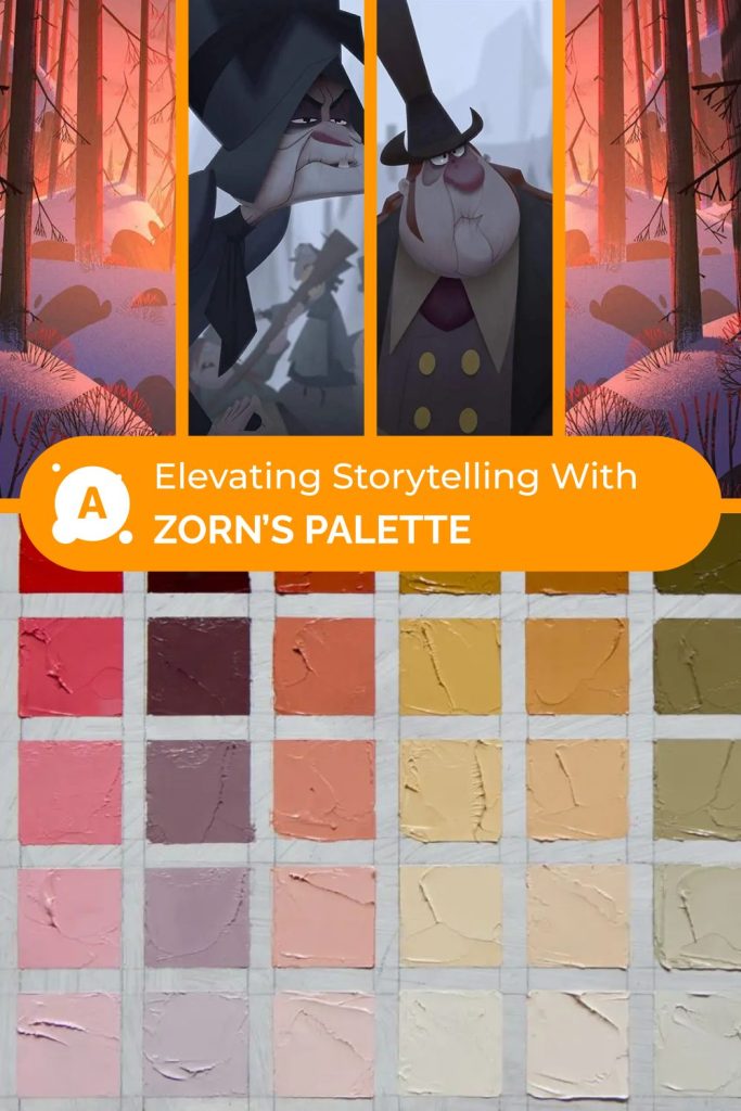
Color is a fundamental element in animation, crucial for setting mood, guiding the viewer’s eye, and supporting storytelling. In this Animation 101 guide, we explore how the historic Zorn palette — a minimal set of colors used by Swedish painter Anders Zorn — can teach modern animators about the power of limited color palettes. By embracing fewer colors, animators can create visually harmonious and emotionally rich scenes even within tight production constraints.
Why Learning Color Theory Is Essential in Animation 101
Mastering color is a wonderful way for animators to bring their stories to life. It’s a significant part of Animation 101 because color allows artists to convey feeling, mood, and character without needing to say a word. Colors can whisper the time of day, bring sunshine or a storm into view, and let us know exactly who a character is deep down inside.
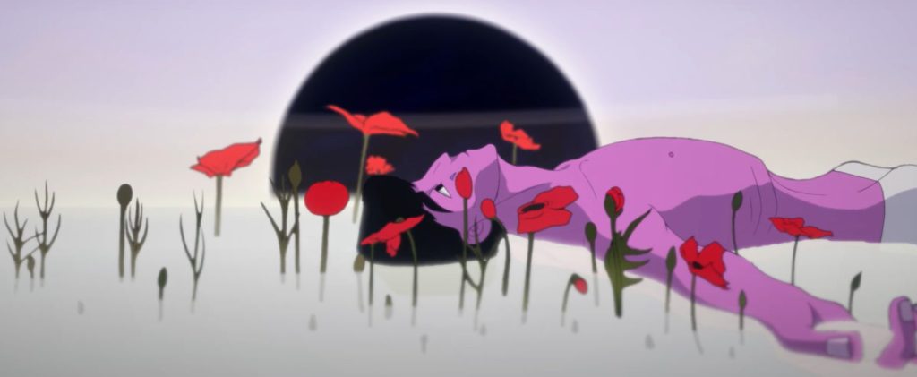
Learn how to use a limited color palette in your work with our <<Short film: Creation Visual development>>
What Is the Zorn Palette and Why Does It Matter in Animation?
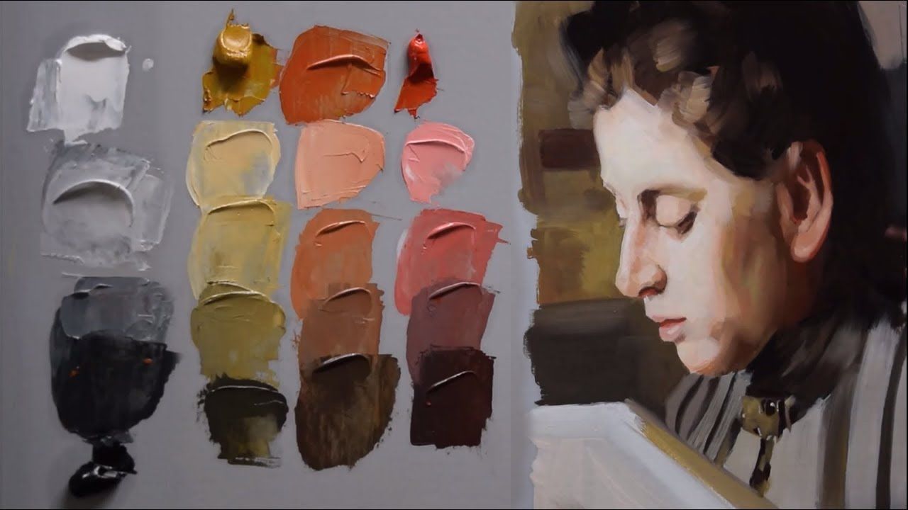
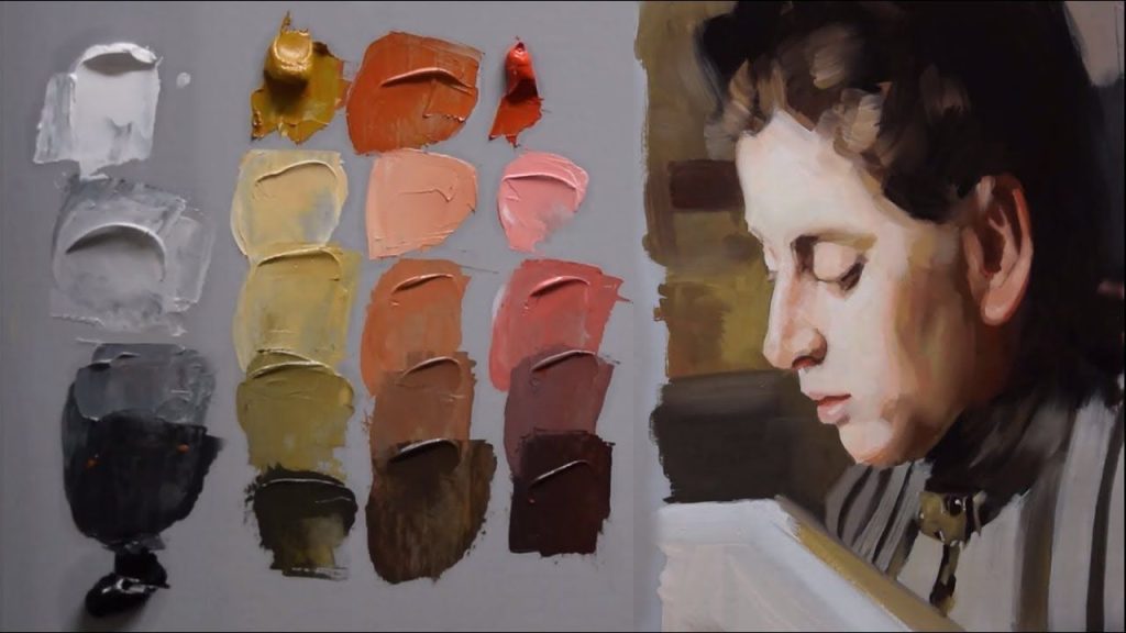
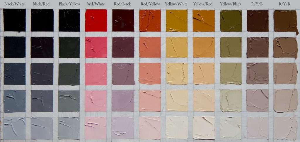
At its core, the Zorn palette consists of just four colors: white (Titanium White), black (Ivory Black with bluish undertones), yellow ochre, and a bright red, such as Vermilion. Despite this simplicity, it produces a surprisingly wide range of tones and moods by cleverly mixing proportions.
For Animation 101 students, understanding this limited palette is crucial because animation projects often face restrictions such as budget limitations, tight deadlines, and hardware limitations. Using a limited color scheme helps animators concentrate on composition, lighting, and emotion rather than relying on endless color variations.
Unlike digital painting, where infinite colors are available, animators working with frame-by-frame techniques or stylized approaches benefit greatly from the discipline imposed by palettes like Zorn’s.
The Role of Limited Palettes in Animation Production
In animation, a limited palette is not merely a restriction — it’s a creative challenge. When you cannot freely add every shade, you learn to maximize the contrast between light and shadow, balance warm and cool tones, and strategically place color accents.
Warm colors from the Zorn palette, such as yellow ochre and vermilion, evoke feelings of warmth, comfort, and nostalgia. Meanwhile, the cool bluish-black provides depth and a sense of shadow or evening chill. This tension between warm and cool is a powerful storytelling tool.
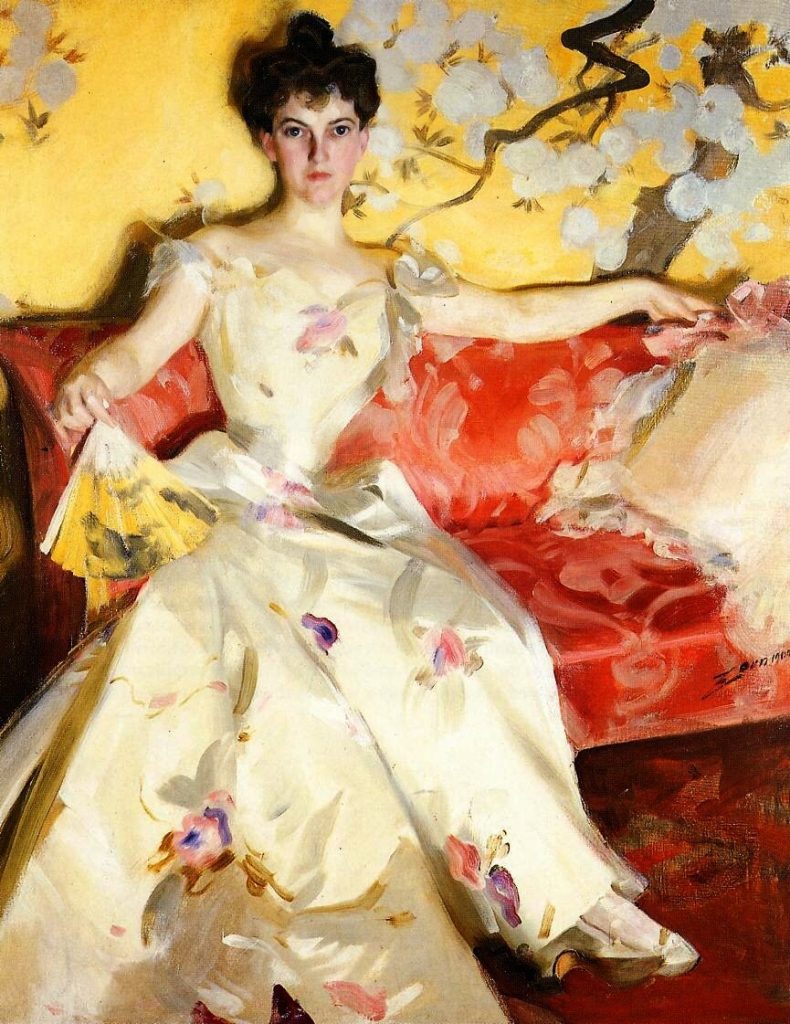
Female portrait, artist Anders Zorn
Limited palettes also ensure visual coherence across scenes and frames, a vital factor in animation where rapid frame changes can overwhelm the viewer if colors clash or scatter too much.
Examples of Limited Palette Use in Animation
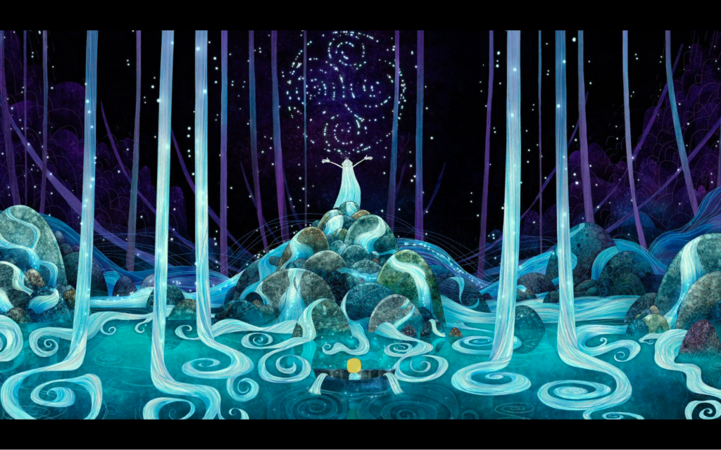
Song of the Sea
Several critically acclaimed animated films perfectly illustrate the power of limited color palettes in enhancing mood and storytelling. For instance, Song of the Sea employs a carefully chosen palette of cool blues and warm, rusty ochres, creating a poetic and almost melancholic atmosphere. This restrained use of color makes every scene feel cohesive and intentionally composed.
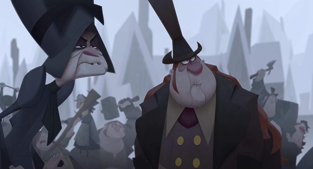
Similarly, Klaus features striking contrasts between cool blue tones and warm reds.
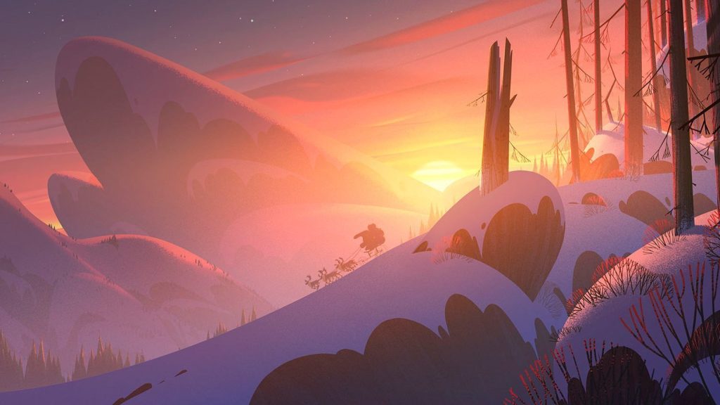
Klaus
This combination not only reinforces the chilly winter setting but also adds warmth through the use of red accents, thereby strengthening the emotional core of the story.
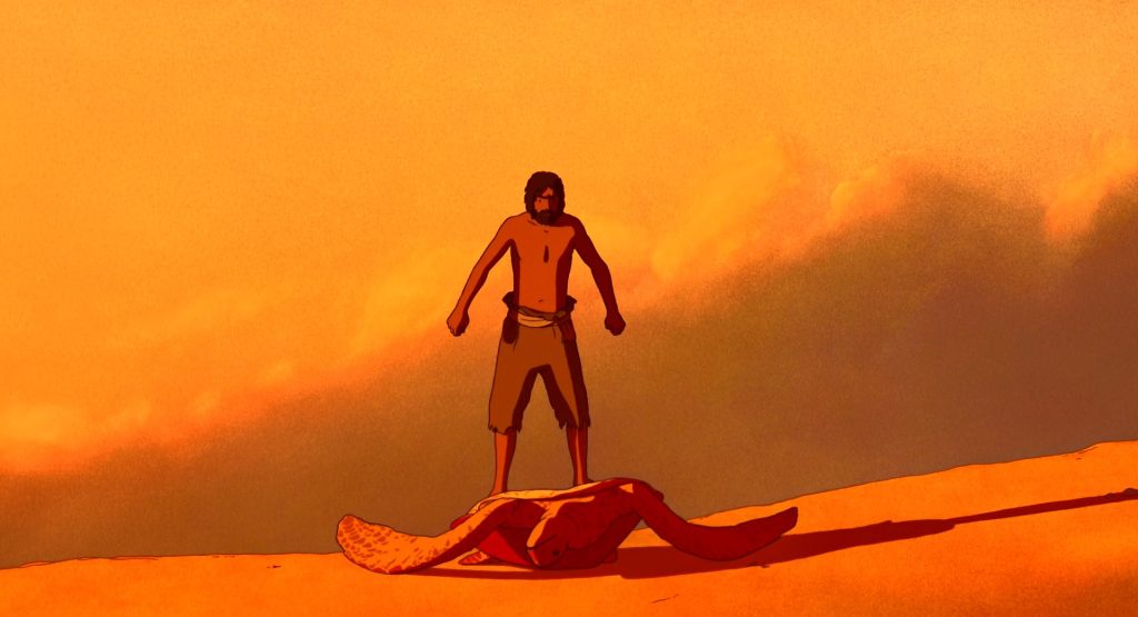
The Red Turtle
In The Red Turtle, minimalism takes center stage with earthy tones and subtle pops of color. This approach maintains clear and emotionally resonant visuals, relying on simplicity rather than complex palettes to convey its message.
Persepolis offers a different yet equally powerful example, telling a deeply personal story through black-and-white animation. This absence of color becomes a deliberate artistic choice, demonstrating that even without hues, animation can still deliver a strong emotional and narrative impact within Animation 101 contexts.
Pink Floyd – Brain Damage
A perfect contemporary example of how color and atmosphere create emotional depth is the student video titled Pink Floyd – Brain Damage. This piece delicately explores the fragile boundary between what is considered «normal» and «broken» in our consciousness. Through minimalistic yet thoughtful color choices, the animation conveys the vulnerability of the mind, like a child trapped inside a cage or hidden in the darkest corners of our psyche. Beyond demonstrating how color supports deep meaning and mood, the video carries a powerful message of self-compassion and understanding.
Practical Tips for Animators: Applying Zorn’s Palette Principles
If you’re just starting Animation 101 or want to refine your color skills, try incorporating these ideas inspired by Zorn’s palette:– Choose your core colors carefully — white, black, a warm yellow, and a bright red form a solid base.
– Focus on tonal values: work with light and shadow to create depth rather than saturating with many colors.
– Use red sparingly as a visual focal point to draw attention or highlight important story elements.
– Balance warm and cool tones to evoke the right mood for your scenes.
– Practice creating animatics or keyframes with limited palettes to strengthen your storytelling focus.
For those developing not only color skills but also overall storytelling, enrolling in courses like Short Film Creation: Visual Development can deepen your understanding of how color interacts with narrative structure and design. Likewise, the course Acting in Traditional 2D Animation will help you bring characters to life with expressive timing and emotion, complementing your mastery of color with dynamic performance.
In parallel, if you are working on character designs for your animation, understanding how to create strong concept art is crucial. There’s a great article on How to Create Concept Art for an Animation Character that covers essential steps to bring your ideas to life — combining solid color choices with compelling design can really enhance your animation process.
Working this way develops your understanding of color temperature, contrast, and emotional impact, vital skills for any animator’s toolkit.
Conclusion: The Power of Simplicity in Animation Color
fi.pinterest.com
Zorn’s palette reminds us that sometimes less is more. For animation students and professionals alike, using a limited palette is a practical way to create depth, mood, and harmony. It challenges you to focus on storytelling essentials and helps maintain visual consistency.
By integrating these principles into your Animation 101 practice, you’ll be better equipped to produce compelling animations that resonate with viewers — no matter the project size or complexity.
Have you tried working with limited color palettes in your animations? What challenges or successes did you experience? Share your thoughts below!